Picking a colour from a Pinterest board is one thing. Picking a colour that will read the way you want in your specific room is another, and north-facing rooms are where the gap is widest.
North light is cool, low-energy and steady all day. It strips warmth out of everything. Colours that look glowing in a south-facing showroom can look grey and lifeless on a north wall.
What north light does to colour
- Cool whites read blue and clinical.
- Pale greys flatten to a single grey-blue note with no depth.
- Soft yellows go green.
- Off-whites with a pink undertone go grey.
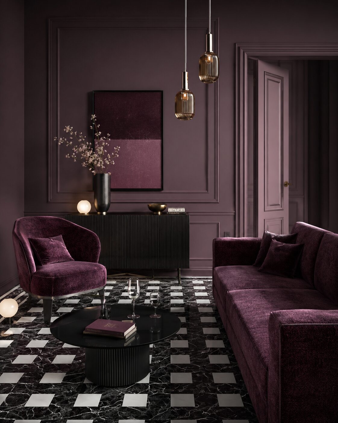
- Deep colours hold their character — north light suits them.
Shades that hold up
- Warm pales with real pigment — our Alabaster, Bone, Linen and Soft Sand all carry enough warmth to survive north light.
- Mid-tones with brown or honey undertones — Mushroom, Pebble, Greige.
- Saturated deep colours — north rooms are where Forest, Plum, Midnight Navy and Charcoal genuinely shine. The low light flatters depth.
- Pinks with a clay undertone — Blush, Rose Clay, Lavender — read soft rather than dusty.
Shades to be careful with
- Brilliant whites — they go blue.
- Pale greys without a warm pigment — they go flat.
- Cool sages — they can read khaki.
- Mid-blues without a violet or grey undertone — they go cold.
The sample step matters more here
For south-facing rooms, you can often pick from a swatch card and be fine. For north-facing rooms, get a physical sample and live with it on the wall for at least 48 hours — morning, midday, evening, lamp-light. The colour will tell you whether it's right.
Our hand-poured A5 samples are free across the UK. For a north-facing room we'd suggest taking three samples in the same family rather than one — north light is where you discover that the shade you wanted is actually the one next to it.